Swedish Recycling UX Case Study
Design & Build
Ideate, sketch, design and prototype
Test the prototype with customers
Iterate & build the product with internal tech team
Give the working product to customers to validate
Discovery
Competitive landscape
In-person stakeholder & customer interviews
Survey to 23,000 customers in Sweden
Customer journey & pain points
Our tasks were non-linear and often happening simultaneously. We alternated between stakeholder and customer interviews throughout the timeline to constantly validate, learn and iterate on a solution that’s functional for everyone.
In-person stakeholder interviews
Through ongoing stakeholder interviews, we not only learned about the world of recycling and waste, but the organizational structure of the company.
We interviewed people from all levels of the business - including the CDO, designers, tech, sustainability managers, customer service, sales and the truck drivers that pick up waste at customer sites.
Key learnings
The complex logistics of recycling pick ups and material processing
Different levels of the business have different goals, sometimes goals that are in opposition to each other
Internal communication was a consistent pain point flagged across all teams
Key actions from the learnings
Build a customer journey based on the service offering and assumed customer pain points (to be validated)
Work towards a product that navigates the businesses communication constraints and provide future solutions
Discussing internal tools, customer pains and our initial prototype with the sales team
Discussing waste flow, top issues with pick ups, customer interactions and improvements with truck drivers
Learning about the circular economy from the sustainability manager
In-person customer interviews
My favorite part of this work was talking to real customers and visiting customer sites.
We were exposed to a wide range of businesses, from local staples to Sweden’s largest, industrial giants. We interviewed a a multitude of roles within that space, from Waste Operators, Waste Managers to Sustainability Managers.
In the initial phases, we gathered insights on the customer’s general relationship to recycling. When we moved into design phases, we added prototype testing to get pointed feedback.
Once we had enough research to know the product would be in the business-customer communication space, our focus shifted to speaking with Waste Managers who oversee the daily, hands-on recycling tasks.
Interview details
Question categories
About you: What is your job role and background?
Recycling details and history: What services do you use, what type of waste do you have on-site, what are your daily/weekly reyccling routines and tasks, what are your touch points with the company, how do you communicate with your team?
Goals, needs and pain points: What concerns or problems do you face with internal tasks, and how is the recycling company involved? Any problems with the core service? What improvements do you want to make?
Digital tools: What (if any) digital tools do you use to manage recycling? How is that working?
Sustainability: Their future goals for sustainability (if they have any, and why not)
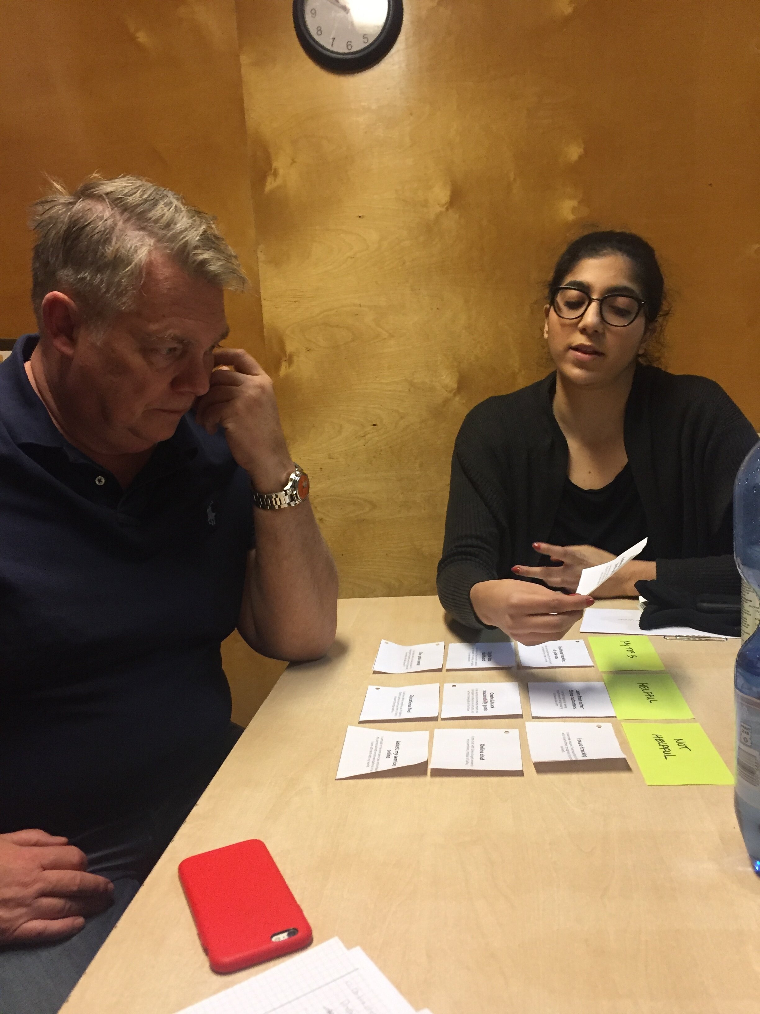
Card sorting exercise
We utilized a card sorting exercise to have customer’s rank the digital opportunity spaces we had identified based on our research. We did this exercise with every single customer, regardless of their role or company size.
Each card contained one digital opportunity and a short description. We had them sort the cards into three categories:
(1) My Top 5 (2) Helpful (3) Not Helpful
We were able to understand the customer’s priorities based on their job roles. These insights helped us develop which product space to focus on right now, as well as how to evolve it into something bigger over time.
The card sorting exercise completely changed our assumptions of what the customer would want. What we had assumed would be the top digital opportunity was the one the customer’s found the least helpful - proving that customer feedback is essential before spending time, money and effort to create a product that customers don’t actually need.
Card sorting exercise with the Waste Manager of an automotive recycler site.
Pure aluminum waste sorted at an automative site. At each customer site, we learned the way they sort their materials and where their bins are located.
Tracking Results
We utilized Google Sheets as a collaborative tool for the team to track each interviewee and summaries of their pain points, goals and card sorting results.
While this was a successful for seeing everything in one place, the large blocks of text eventually became hard to manage with the formatting of Google Sheets. In the future, I would look for an alternative tool.
Our interview documentation in Google Sheets
Customer Interview Challenges
Planning and scheduling: Working with real customers was complicated because we were at the will of their schedule, not ours. Our project had a certain pace, and there were weeks where customer schedules didn’t allow for us to have as many interviews as we needed. While we found exercises and ways around this, it was a very difficult aspect of planning.
Travel: Each customer interview was done on-site, meaning we had to travel to them. We did this for two reasons:
To make it easy for the customer, as our work relied on their participation.
To visually understand their waste set-up. Some of them were alarmingly complex and it was incredibly helpful to see first hand how their operation worked.
3. Language barriers: Our team spoke English, and … we were interviewing Swedes! This ended up being a smaller challenge than anticipated as English is widely taught in Sweden, but sometimes there was miscommunication and it would have helped to have a translator.
4. Narrowing down the details: As part of a small agile team, we often had very little time to properly analyze each interview. Because we started with a blank slate for the project, every detail could have been the direction we would take the work, and it was hard not to get caught up. By the end of the project, we understood exactly what the top takeaways were (typically what was top of mind directly after an interview), and moved forward with that.
Customer journey & pain points
Our first draft of the customer journey was created after a week-long sprint of stakeholder interviews. We continuously updated the journey based on real feedback from our customer interviews.
As our first task was to focus on creating a product for existing customers, we focused on the “Use Service” portion of the journey. The vision team would then later take a step back to execute the entire range of the journey.
We noticed areas of improvement based on the way the “pain point” sticky notes clustered or built up around certain tasks in the journey.
Key learning
The most common customer pain points had to do with improving communication.
Key actions from the learning
Team brainstorm about opportunity areas within the “communication” space
Creating hyper-focused journeys
Through our in-person customer interviews, we got chance to see first hand how waste flows from one place to another within a customers’ site. We were able to learn about the miscommunication that occurs throughout this process, and that communication is not only an issue between the customer and the business, but an issue on large customer sites.
I created a visualization of the flow of waste within a customer site, to getting picked up. A huge pain point for customer was having to backtrack to find the source of where incorrect sorting originated.
Ideate, sketch, design and prototype
Our ideation sessions were interwoven with the research process. The more we learned, we would pause to narrow down an area of focus by doing group exercises, affinity mapping and brainstorming sessions.
Narrowing down the current research using an affinity mapping exercise. What are the biggest themes or categories we heard based on our interviews?
Once we had narrowed down the research using affinity mapping, we brainstormed on design ideas that correlated to each. We then plotted those ideas on an axis of Customer Value vs Business Value. We took the highest value and lowest effort ideas and re-plotted them using Customer Value and Tech effort.
Based on the categories from affinity mapping, what ideas could we create around them?
This exercise helped us narrow down the top three ideas, which we took into a design exercise with the entire team.
These exercises not only increased team bonding, but ensured that no one was excluded from key decisions about the direction of our work.
Once we had decided the initial features for the mobile app, we began sketching, wireframing and prototyping.
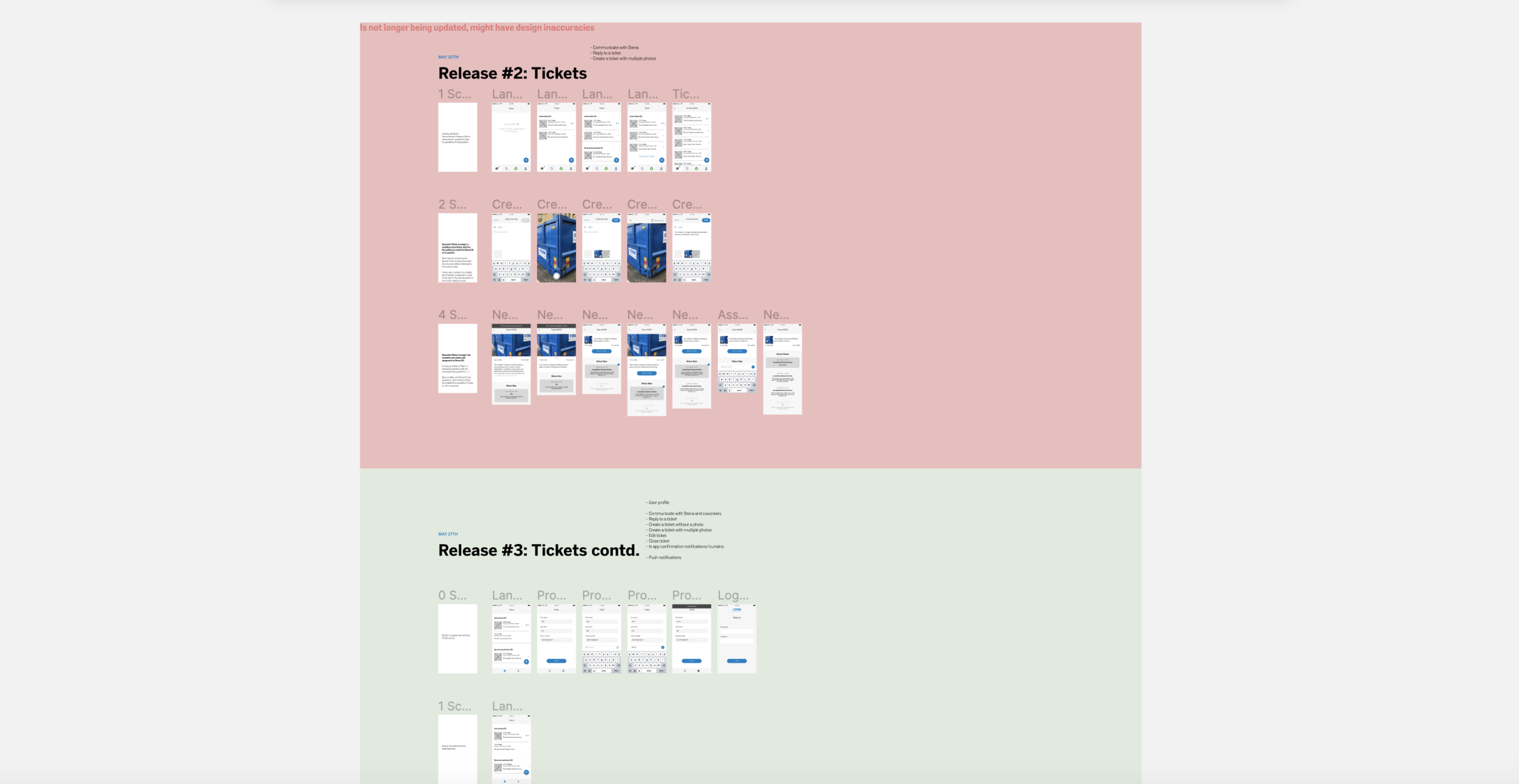
We used Figma so our tech team could view the work that was final (and use Figma’s dev tools), and the work that was currently in progress.
Designing to increase communication
Signing In
Submitting a Ticket
In Progress Tickets
The Figma file for the IT team
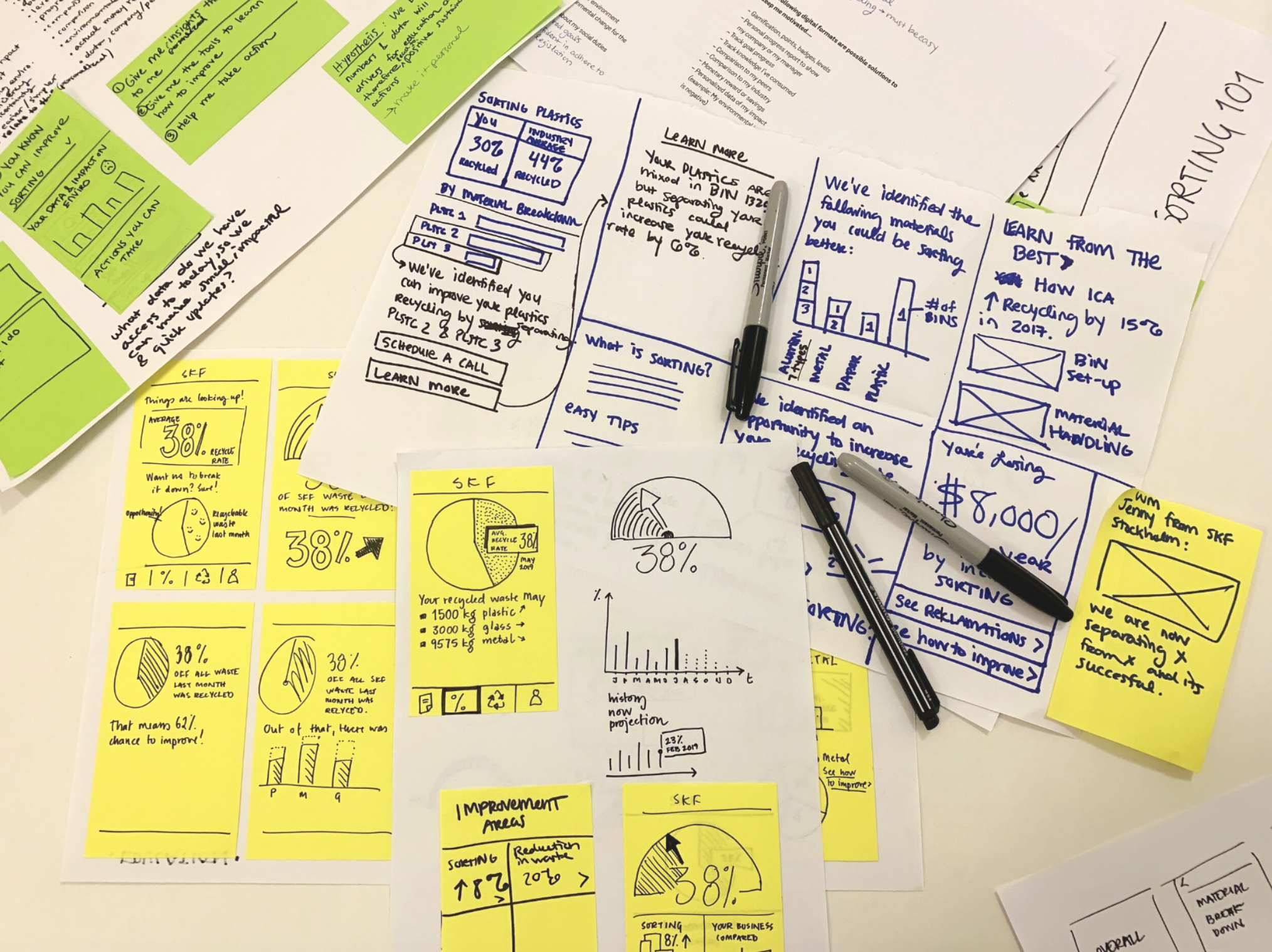
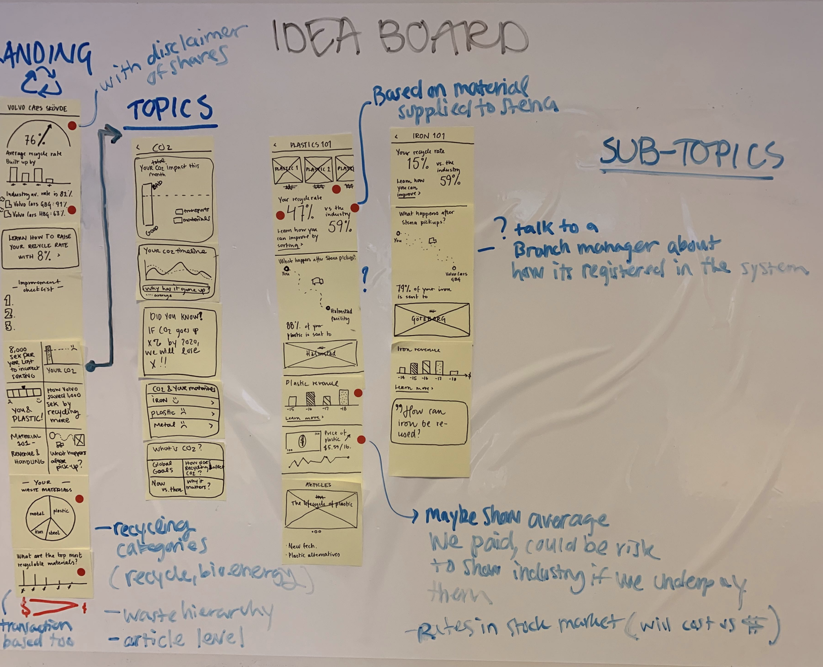
Designing to increase recycling education
Crazy eights design session
Creating detailed sketches and flows
Translating sketches into designs
Test the prototype with real customers
Once we had created the prototype, we added user testing to our customer interview activities.
Some customer’s we created longstanding relationships with and visited several times. They were able to see their initial ideas from the card sorting turn into prototypes, and eventually built into the beta app. This kind of collaboration with customers is what elevated the experience for both the customer and the business.
During the prototype testing, we were looking to see if we correctly translated the digital opportunity into a useful product. Does it have all the features needed? Is anything missing? Is anything confusing?
Showing the prototype and doing card sorting exercises with the waste manager of a large electrical company in Sweden
We also showed the internal tool to the business to get their feedback. These conversations were critical to adding features that we couldn’t have predicted the sales team would need otherwise.
Showing the internal tool to the customer service team
Iterate & build with tech
Daily stand ups
Each morning, our team would conduct a standup meeting around a Kanban board. On the board, we posted cards that represented a user need for the app, like “I want to send in a photo of a problem I’m having.” Then, that card would be moved through phases from UX all the way to live build and internal testing.
We would track how long a card has been on the board to make sure we all know if cards are “stuck”. Then we would prioritize getting those cards off the board faster. If we were waiting on a meeting with someone, we would follow up. This way, we had full transparency as to tracking progress for features, blockers, and who is working on what.
Weekly meetings
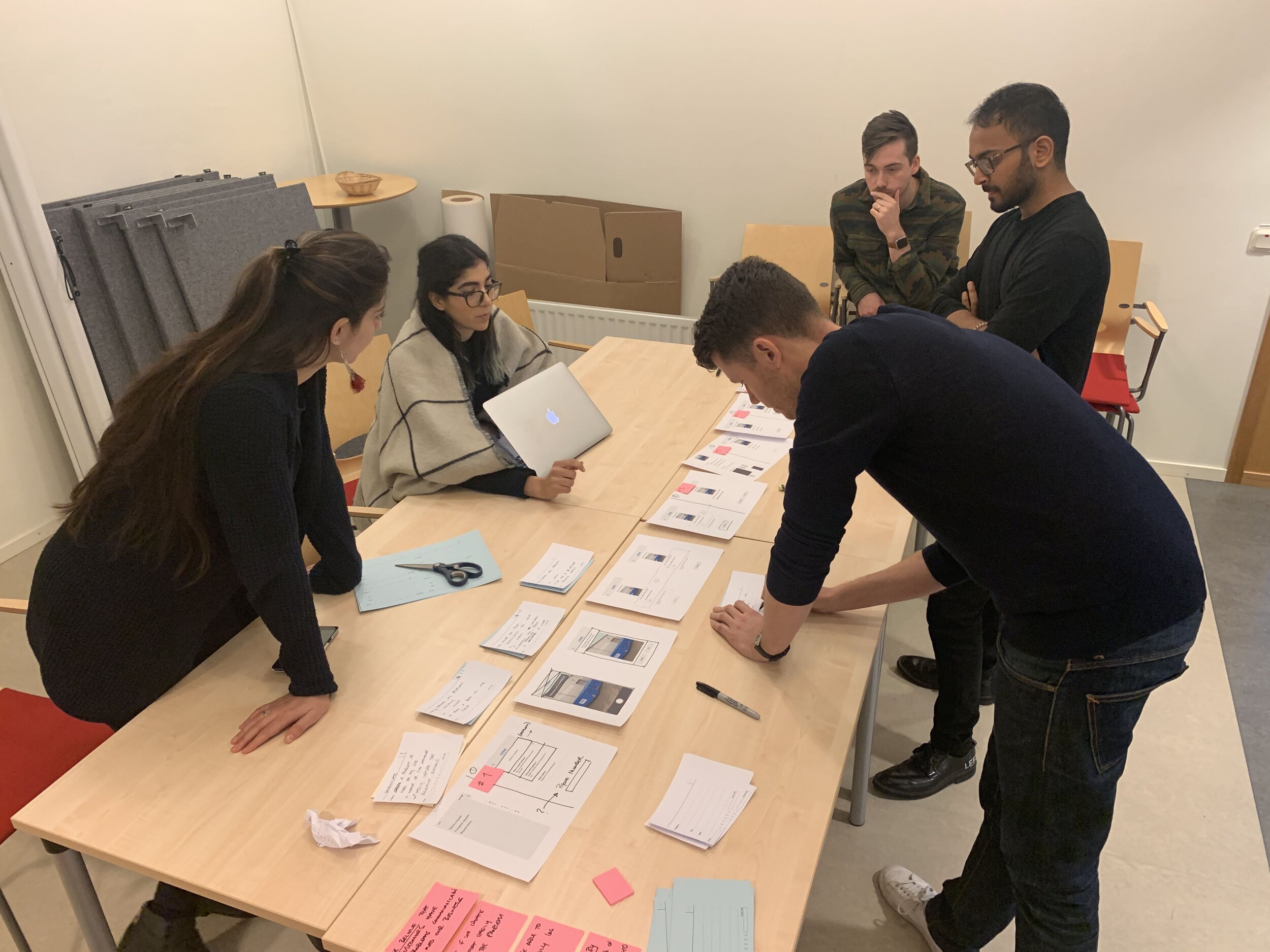
Once a week, we would meet to create new cards for the Kanban board. We would print out the latest screens, and prioritize which ones to start on first. To work in the most agile way possible, we talked through everything and jotted down notes instead of organizing them in a presentation or deck format. If anyone had a follow up question, they could just ask since we were all sitting in the same room.
We would post the printed screens on the walls for reference. This way, the team could see the latest work and have discussions more easily. Also, anyone from the company that dropped by the room could glance at our latest progress. Often, this would spark crucial conversations that would open up possibilities, like connecting us to person who specializes in what we needed to move forward. “Oh, this reminds me of someone else on my team…let me connect you”
My blanket is very fashionable thank you for noticing.
The Three Amigos
About twice a month, we would hold a meeting called The Three Amigos. The basis for this meeting was that three people, from three different disciplines (UX, tech, product owner), would meet to discuss user requirements for each new card for the board. Each discipline would bring their own crucial perspective to the card at hand.
We would discuss each card in terms of requirements for the user. For example, if the user wanted to submit a photo, we would get into the features and stories behind that — such as being able to open up the native camera roll, take a photo using the app, add multiple photos etc. We would also uncover certain technical blocks during these conversations. We would often adjust designs to accommodate these or come up with innovative solutions to get around blockers during these meetings.
Ultimately, collaboration was at the heart of our success. Each member of the team worked in the same room, sharing the same space.
Beta app given to customers
Our very first ticket submission!
Redesign the app
Once the app was given to customers and the need for it beginning to get truly validated, we brought in a designer to overhaul the existing designs and create a new and improved brand guideline for the company.
Key Takeaways
Working on this team was incredibly rewarding as our mission was ultimately to create a more sustainable world. Through small steps to modernize recycling, businesses can shift to more efficient recycling and eventually focus on waste reduction.


