My Verizon Shop
Opportunity
Increase online sales by creating a simple e-commerce experience where users can purchase products, upgrade and add devices to their account.
UX Tasks
– Wireframing & Iterations
– Lead weekly client presentations and workshops with IT
– Incorporate business and user feedback into design iterations
– User Testing
Feature breakdown
“Bring Your Own Device”
Allow a user to add a device they already own to their account, through the My Verizon App.
Possible scenario: "I just broke my phone and want to activate an old phone I have saved in a drawer. I can open the My Verizon App and add that device to my account without leaving my home."
Step 1: Evaluate desktop designs & requirements
We used the existing desktop designs to learn about the functionality of the feature.
We also needed to understand variations in requirements for each type of device a user can add. Users can add basic phones, mobile hotspots and tablets to their account. Depending on the device and the brand, the instructions change with each one.
Step 2: Elevate the experience
The desktop experience lists out steps, but doesn’t have any visual references to guide the users to find their Device ID and SIM ID. We decided to create a carousel of “Instructional guides” for users to swipe through that would assist in finding these IDs.
Each image would “flash” on the areas where the user needs to tap into.
Below, you can see a motion prototype of the animated visuals we used to help them find the Device ID if they're adding an iOS device.
And, that meant creating them for every single type of device and SIM a user can add to their account.
For devices where there wasn’t a visual reference available, we used only instructional steps in the cards instead of visuals.
We also added a scanning capability for users who had their devices’ box. The process could become even more automated.
Step 3: Create the happy paths
I focused on a user adding an iOS Smartphone to create the happy path.
It was important to look at the entry point: Users can enter this feature through their Devices tab. They can tap on “Add Device” and be confronted with two options: (1) Purchase a new device (2) Add a device I already own.
To reduce cognitive load, each screen focused on one decision that a user had to make. Especially since some of the steps in this process were a bit more complex.
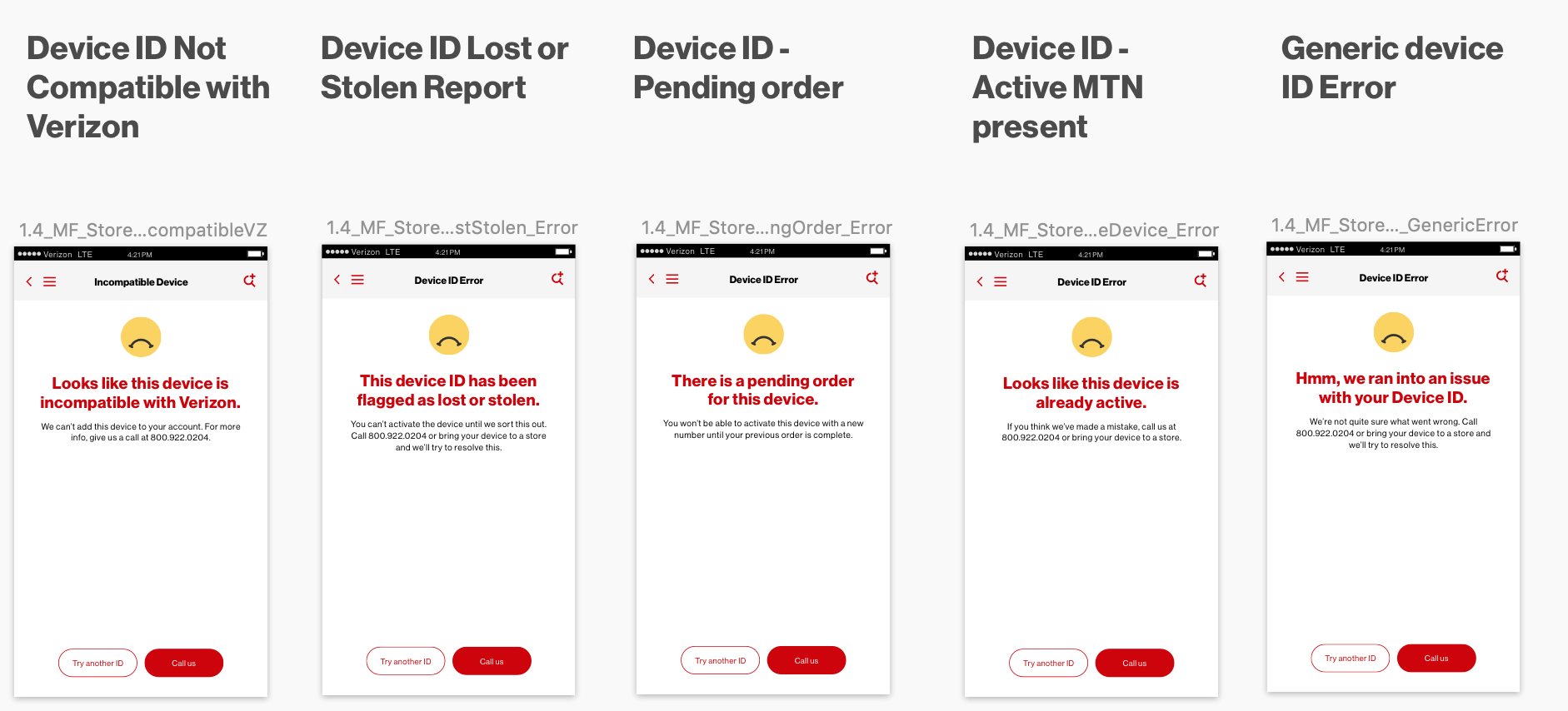
Step 4: Identify error states
Through the process of identifying requirements and creating the happy paths, I had identified plenty of error states that could occur during the experience. We took these back to Verizon and discussed which ones were and were not viable error states. The final ones can be seen below.
Team
UX Mor Weizman | Design Taneisha Kirchner | Project Manager Amir Aziz
UX Director Munawar Ahmed | Design Director David Clarke | Copy Director Tim Shin
Over 100+ stakeholders


