Wild Turkey Bourbon
Opportunity
Wild Turkey Bourbon is a USA distillery specializing in Kentucky Straight Bourbon, with historic roots beginning in 1855.
Their existing site was outdated and lacking in organization and hierarchy. Our opportunity was to spend three months building a completely new website from the ground up.
UX Tasks
Audit the existing site, including UX analysis, sitemap and content
Create a new sitemap and IA
Sketch, wireframe, design and prototype
Iterate & build the product with internal tech team
Auditing the Existing Site
By doing a thorough audit of the existing site, I identified the key areas of that were lacking:
A cohesive brand story
A simple way to discover products
A clear path to purchase
An organized hierarchy for easy way-finding
Below, you can find an analysis on three existing pages that explain these pain points.
The Existing Homepage
The Existing Product Gridwall
The Existing Product Detail Page
The existing site was ready for an upgrade. From here, we began re-imagining the site from the ground up, addressing each pain point.
Grounding Principles
Based on the goals of the brand, UX analysis of the site, and analytics from their existing site, our team aligned on the following principles to guide us while creating the site.
These principles would come to inform the content, hierarchy and overall experience.
ENABLE PRODUCT DISCOVERY
Increase both discovery of products and understanding between products.
CONVEY THE BRAND AND HISTORY
Ensure users understand that Wild Turkey means expertise, a rich history and high quality standards.
PREMIUM DESIGN
Introduce a premium look and feel to elevate the brand.
ENCOURAGE LEARNING
Ensure that both newcomers and dedicated customers can find the level of detail they’re looking for.
Creating a New Sitemap
The first step was gathering all the content from the audit, and re-arranging it in a structural way that would make sense for both the user and the brand.
I narrowed down the number of navigation items to 5, instead of 8. This was possible by moving less visited pages, based on analytics, like “News & Events” to the footer. Also, condensing repetitive content into one nav item such as “Heritage & Craft.”
Reducing the number of items allows the user to focus on the most salient information.
Wireframes
Once the new sitemap was completed, I moved on to laying out the content hierarchy in wireframes.
Homepage Wireframe
For the Homepage, I structured the main pieces of information a user would need to know as they’re browsing the site. Since there wasn’t time for user testing, I used my personal expertise, competitive research, my team and clients to ensure it was the right direction.
I began by writing out the questions a user may want answered as they view the homepage:
What is this brand about?
What are their most popular products?
How are they made?
Who are the people behind those products?
And then, translating those questions into a low-fidelity wireframe:
Product Gridwall Wireframe
For the Product Gridwall, the first order of business was to add differentiation between the all the products, which look quite similar at a glance. This was possible by grouping them into categories and collections - and adding a description for the high-level collection + a short one liner description for each product.
It’s important that users feel confident about why they’re clicking on one product versus another.
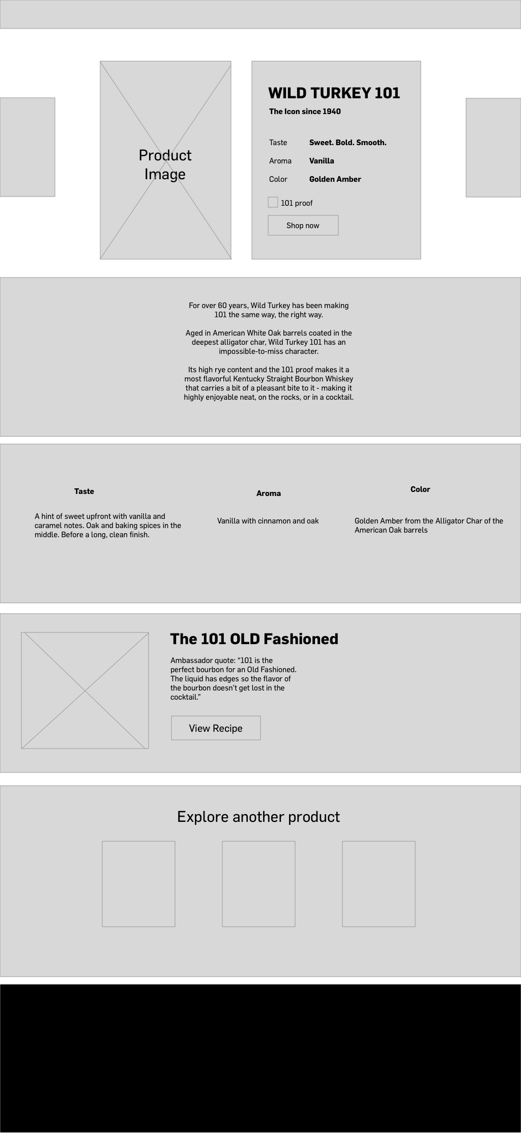
Product Detail Page Wireframe
From there, I continued in more detail to define every page on the site. Below you can see the Product Detail Page, with enhancements such as a quick, scannable breakdown of the top tasting notes of the product. This way, users who are just browsing don’t have to dig through long paragraphs to understand the difference between the wide variety of products Wild Turkey has to offer.
If a user is interested in more information, they can scroll down the page to get more elaborate details.
We also wanted to encourage discovery by including two ways to navigate through products - by transforming the hero image into a carousel, to flip through other products, as well as including more products at the bottom of the page.
New Branding
Concurrent to the process of a new sitemap and wireframes, we were also working on exploration of new branding for Wild Turkey. In collaboration with our talented designers and the clients,
Team
UX Design Mor Weizman | Design Elena Bertolin & Kate Scally | Creative Director Josh Combs


